Welcome To The Mothership
In March 2013, I went in for an interview at the Shopify office in Ottawa — which was then on York Street, in the Byward Market.
When you took the elevator up to the 2nd floor, you were greeted with the amazing illuminated illustration by Michael Zavacky “You have arrived at the Shopify Mothership”. I always loved this piece of artwork, and thought it was such a wonderful way to be welcomed into the office. It really stuck with me.
In 2015, Shopify moved to 150 Elgin street, and as part of that move we now had a 6th floor café which would be a primary way for guests and employees to enter the office.
I was humbled to be asked to design a chalk mural for the café and that's how this project got started.
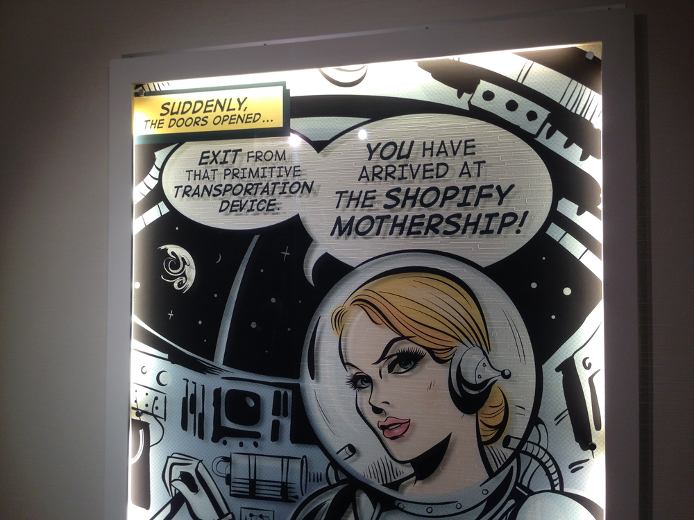
Illustration by Michael Zavacky
Research and Exploration
I knew from the very beginning that I wanted the concept to be centered around the mothership, and started by finding typography compositions that might work well for the level of detail that is available with chalk. I wanted it to have both the feeling of it being done by hand, but also with a high level of detail, given this mural would be more than 10 feet wide.
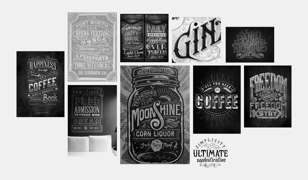
Moodboard of reference imagery by various artists
Early concepts
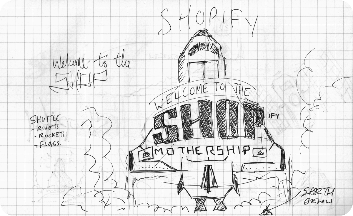
Since I was set on this concept of a mothership and space, there were a few different directions worth considering: was it a rocket? A satellite? A space shuttle? Something else?
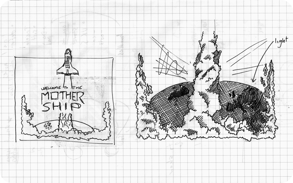
The first concepts I played with were centered around a rocket, but there were two main issues with that. One was that having the typography and the rocket work well together was a bit of a challenge, but in addition, a lot of the early rocket concepts were overly phallic. It wasn't really landing, and so I went back to the drawing board.
After exploring the rocket, I looked at the idea of a space shuttle, and satellites, or the idea of someone looking back at earth. The shuttle concept on it's own really worked, and so I explored how the typography might work with the shuttle, and it became extremely busy.
I was stuck for a while, and couldn't find a way for the shuttle to be both prominent, while also giving way to the message: "Welcome to the Shopify Mothership" which was a real mouthful.
Concept refinement and detail exploration
I was really quite stuck for a while, until I thought about who might have solved this problem before, and it occurred to me that NASA patches have a similar problem: lots of typography and illustration combined into one small package — to varying degrees of effectiveness. That's when I stumbled on the absolutely beautiful patch by Robert McCall for STS-133, which did a fantastic job of finding a home for both the shuttle, and the mission name in harmony.
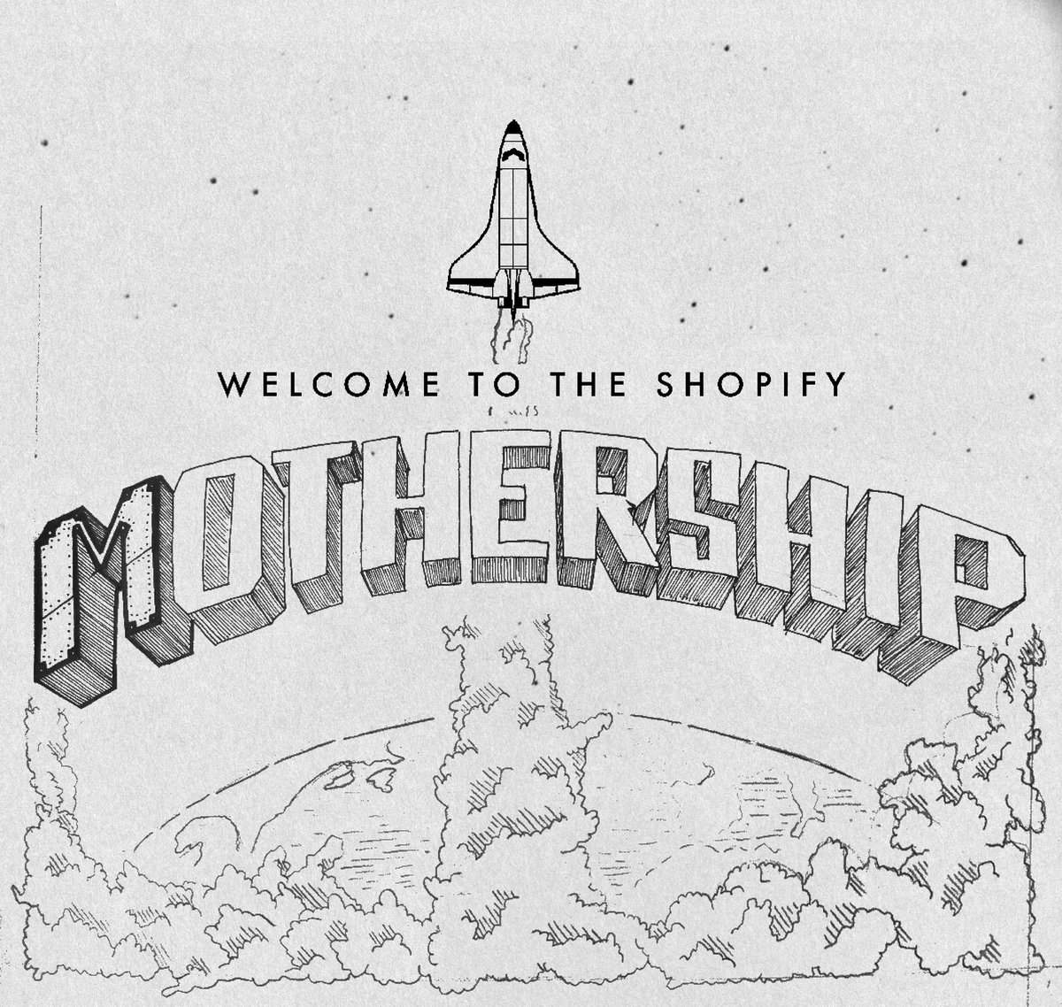
I leveraged a similar visual layout so that the typography could be front and center, while still contributing to the overall composition. With this new composition, it also helped to solve a significant problem with the mural, which was, what goes in all the space on the edges? The billowing smoke and fire cloud helped to fill that space out well.
Style exploration and refinement
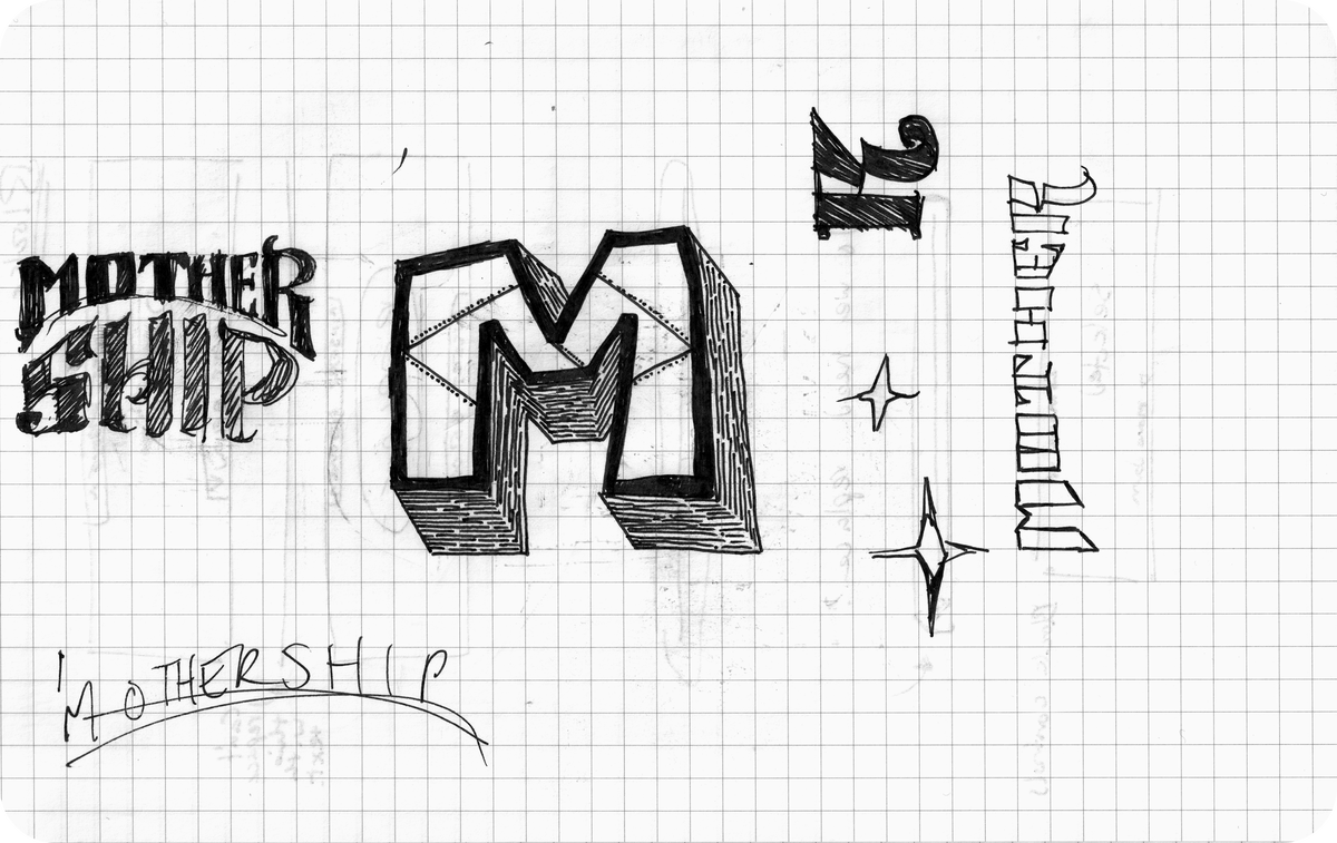
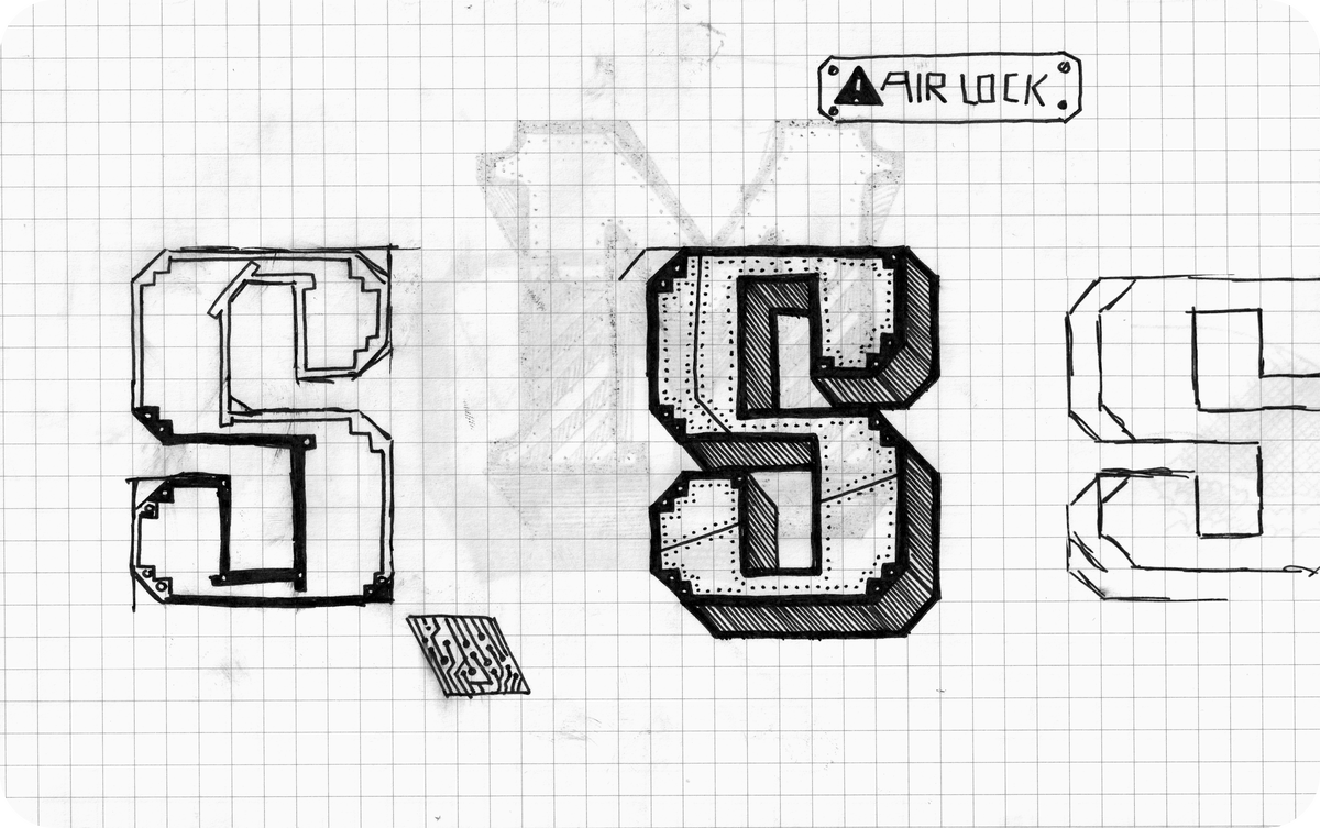
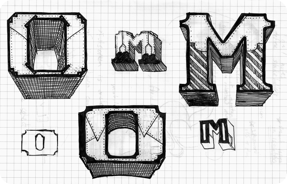
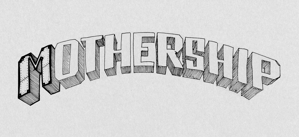
Now that the overall composition was set, it was time to explore what the details of the typography would look like. First I explored embellished-block lettering, but it felt a bit unrelated the space theme. Because of the sheer size of the lettering, it was an opportunity to introduce purposeful detail usually not possible with chalk. I started exploring this idea of metal panels, which led me to researching how the panels on the space shuttle are built and attached. From there different letter styles and shapes were explored, before landing on a robust, mechanical shaped letter form.
Bringing it all together
With the composition in place, and the style complete, it was time to bring them together into a final image that would contain the details at the appropriate scale. The letters and composition were rebuilt, and perspective was introduced to draw the eye from the billowing smoke cloud up to the text. The final composition was designed to match the scale of the final wall width and height.
Creating the mural
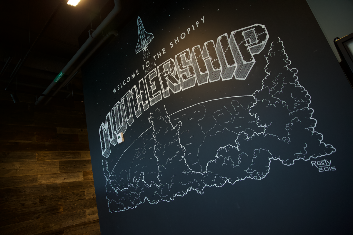
Creating the mural took place over a period of two days. A short throw projector was fixed in place, and used throughout the process to set up the scale and position of the composition. Once that was in place, additional detail was added. The small scale sketches were interesting, but seeing them come together at life size, had an entirely new impact.
The Completed Mural
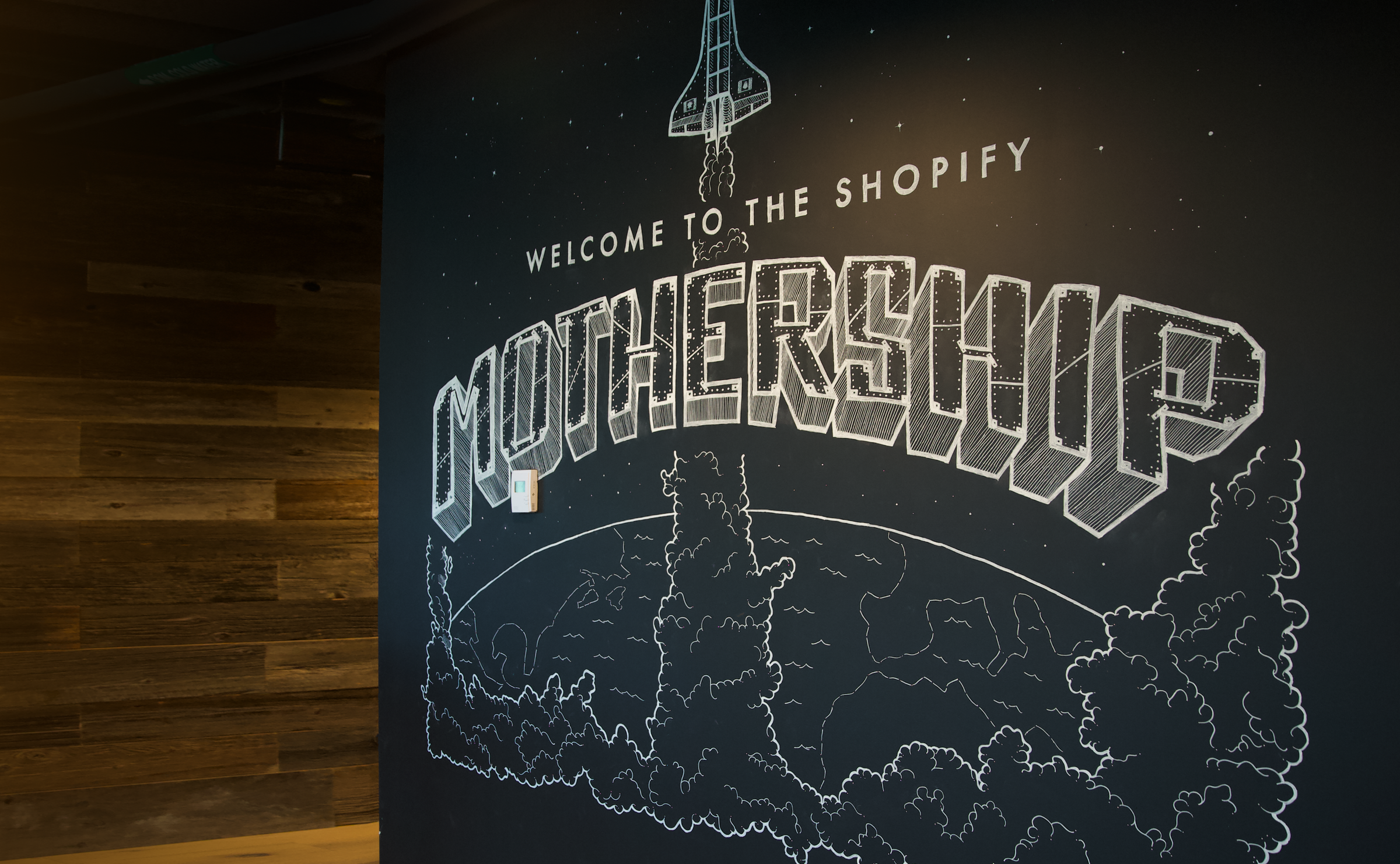
Here you can see the mural and it's details fully completed. I'm proud of the result, and happy to say that it became somewhat of a touchstone for the Ottawa Shopify office, often featured in media photography. I was touched to see that for the 2024 Shopify summit, the mural was reproduced as part of the summit interior design.


