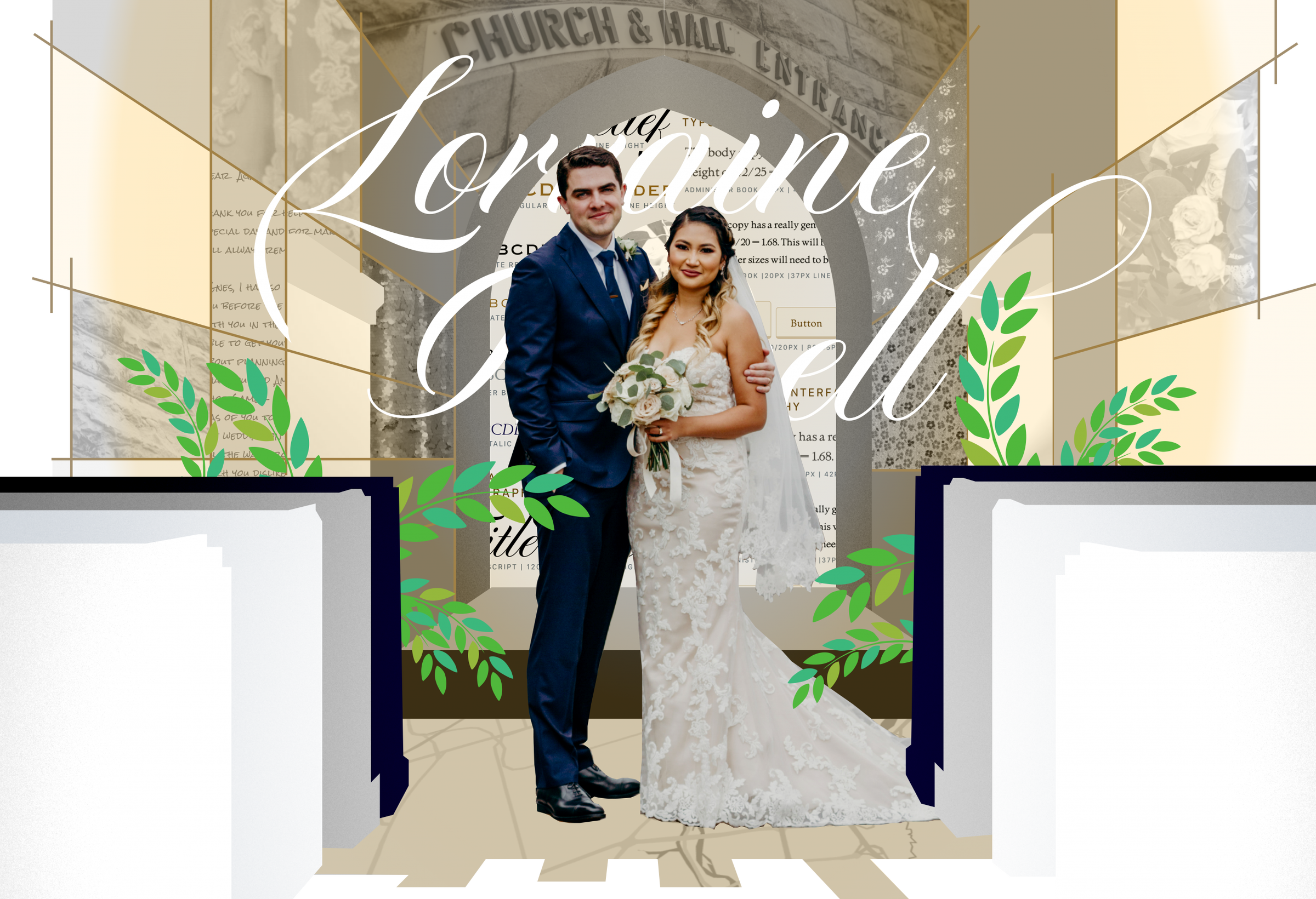
Designing a Wedding
Role: UX design, web development, branding and visual design. Worked with partner/fiancée to integrate feedback.
Brief: Create an elegant, and deeply personal wedding experience for wedding guests. Connect physical and digital experiences from pre-wedding, to wedding day, to post-wedding. Use technology to reduce complexity and effort wherever possible for guests.
Exploration
Platform: I started by investigating the platform to use to handle manage the save the dates, RSVP, and dinner menu selection. The first option was to use a wedding site builder like “The Knot”. The second was to use a plugin integrated into WordPress. The third was to build everything from scratch. The wedding site builder made things very simple, but at the cost of flexibility. Building an RSVP system from scratch had me worrying that I would spend more time debugging than designing. After exploring for a couple weeks, I decided to go with WordPress and the RSVP plugin.
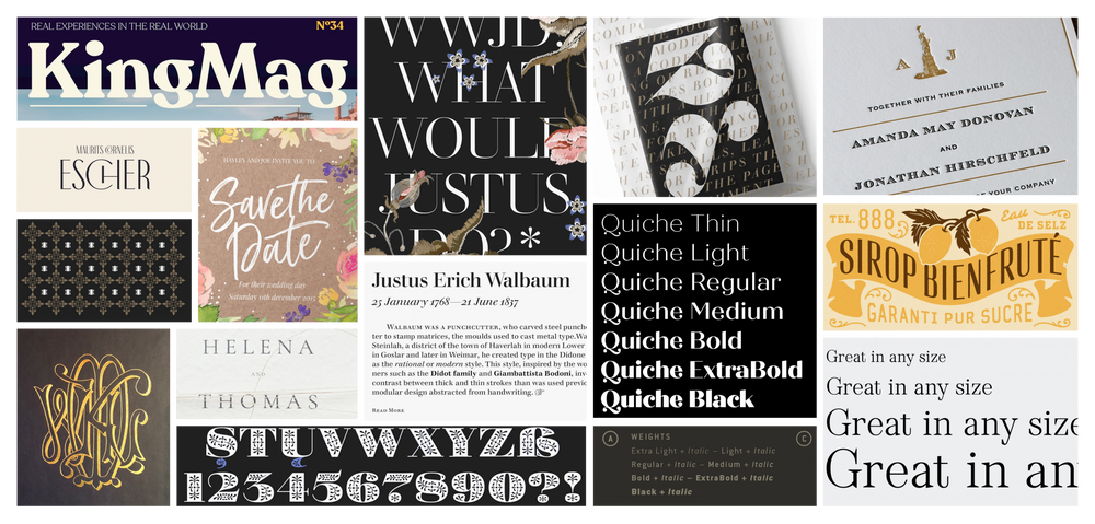
Inspiration mood board
Brand: I started by gathering visual styles, typefaces and colours that seemed to fit the style we were going for. It soon became clear that my fiancée and I had different ideas of what the wedding brand should feel like. Delicate and formal, and robust and casual respectively. I was initially attracted to super families like Speakeasy, and Bonadaro, which had a wide range of script, serif, and sans styles, but lacked elegance.

Different typefaces we considered. 1. Speakeasy Modern 2. Bonadaro Spur 3. Speakeasy Flare 4. Speakeasy Script 5. Fineday Script 6. Bibliophile Script 7. ITC Edwardian Script 8. Duende 9. Diploma Script Pro 10. Auberge Script 11. Bonadaro Script 12. Al Fresco 13. Adorn
Implementation
I created a basic outline which illustrated all of the design components from start to finish. Save the date, RSVP + wedding, physical artifacts, and thank you’s. Reviewing all of the parts quickly became overwhelming. Instead of solving all the problems at once, I focused on the most pressing design component, completed it, then moved on to the next most important.
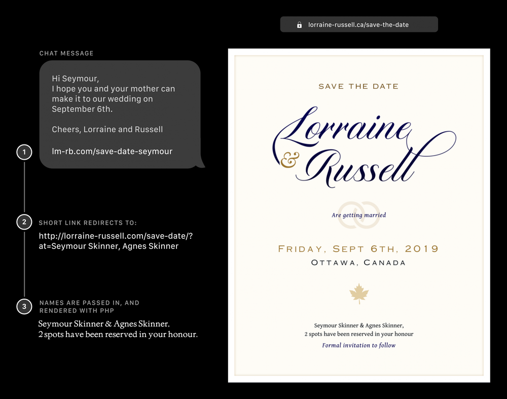
1. Save the Date
The approach of solving each component at a time presented a major challenge for the save the dates and RSVP. I had to be sure the RSVP system would work, but didn’t have the time to fully test and implement it. After some preliminary testing, I decided to completely separate the save the date and RSVP systems. Decoupling these two systems meant that if anything went wrong with the RSVP it wouldn’t affect the save the date setup.
Since the save the dates would be completely digital, I wanted to make them feel very personal to each guest. I built out a simple system to generate custom save the dates, which presented the guest names’ for each party.
2. Brand
After creating the save the date site, I started planning how the colours, fonts, and styles would come together, and be extended in further experiences, like print. The early branding exploration heavily informed the secondary type and colour choices. The priorities were flexibility, clarity, and elegance.
After a bit more iteration, the typeface Administer Book Ad worked really well for the invitations, but struggled with long form readability and legibility, and so I opted to use Gentium Book for the web body font.

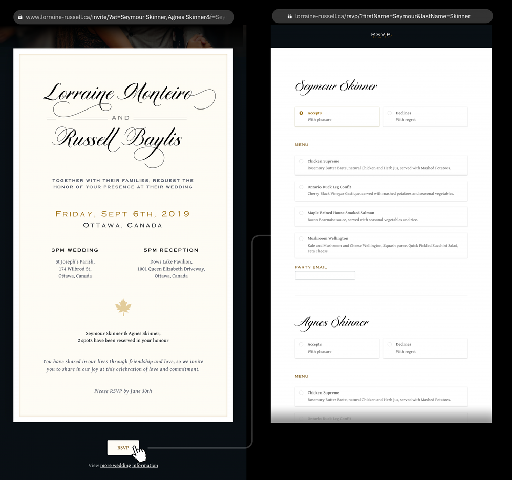
3. RSVP System
After the save the date went out, I started building out the RSVP system, along with the website. Graphically, I wanted to reuse the cursive Lorraine and Russell, but it felt a bit off for a RSVP, which typically has the full names of the bride and groom to be. Diploma script proved to be very flexible with the alternative swash characters.
For the RSVP system, I relied heavily on RSVP and Event Management for WordPress, which handled most of the tough stuff, and I was able to focus on visual presentation.
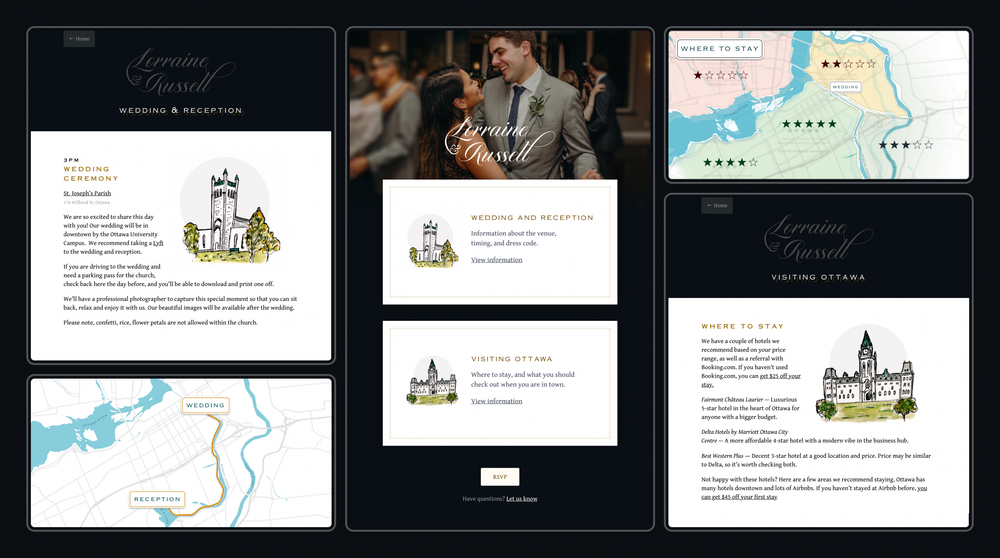
4. Website
The website was launched alongside the RSVPs. The website was designed to provide two groups of information to guests.
1. Wedding day information: What time is the wedding? Where is it? How do I get to the reception from the wedding? How long does it take to drive?
2. Information about the city, for those visiting for the first time: Where are the most convenient neighbourhoods to stay in? How can I get around Ottawa? What is there to do while I’m in town?
5. Print and Physical
The design of the print, and physical artifacts was built out using much of the same colors, and fonts that were used in digital. The welcome to our wedding chalkboard was done with a combination of tracing for the lettering, and flowers above, and free hand for the vines below.
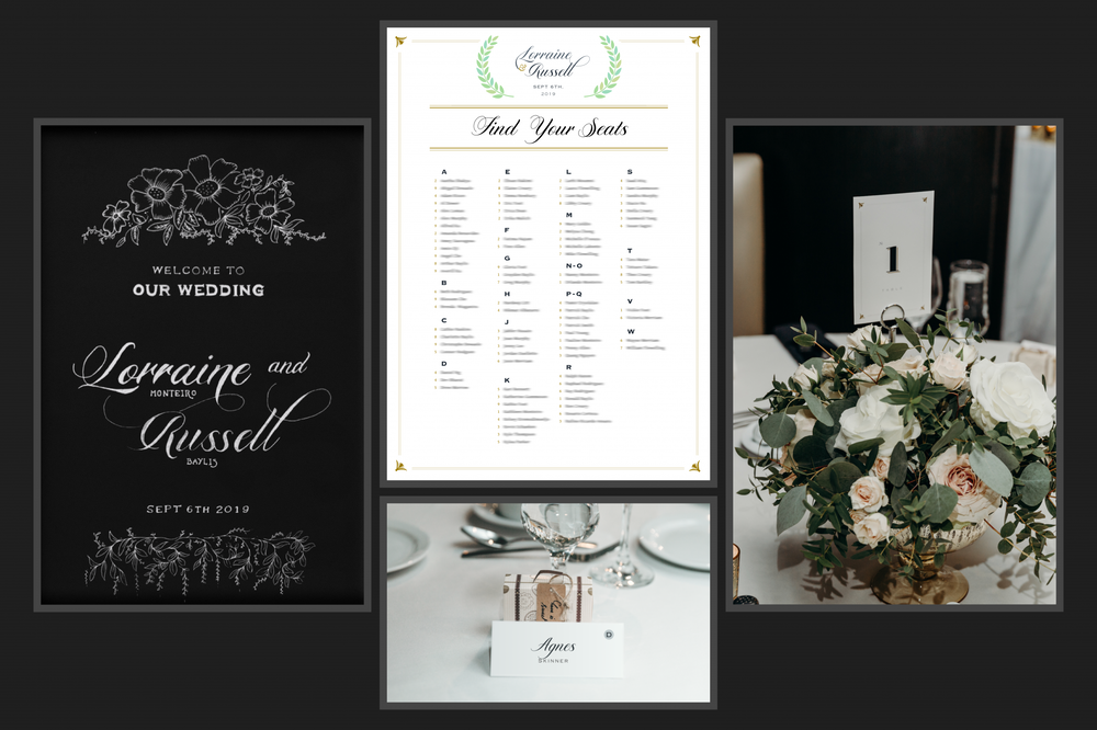
Wedding chalkboard, seating chart, placecards, and table numbers. Photos by Grace and Gold Studios.
Learnings
This project was long running, and had many facets: development, web design, experience design, and print. It reinforced the importance of breaking a complex problem down into smaller goals and tasks. It required careful planning, and acceptance of future unknowns, so that forward progress could happen. The standards for quality were high, and the timeline was fixed. Instead of lowering the quality bar, I opted to take on less, focusing on making the essential pieces powerful.