Storefront Editor
Role
Led the conceptual exploration, and production design of the desktop editing experience.
Brief
Shopify had already taken steps to make what you see is what you get editing powerful and fluid, with the launch of the storefront editor in 2015. The problem is that editing your theme is made up of fixed settings. Want to add multiple image and text sections? You can’t. Want to to reorder content? You can’t. Merchants want intuitive dynamic content editing. We set out to solve that in a way that aligns with Shopify’s strategic direction for the Online Store.
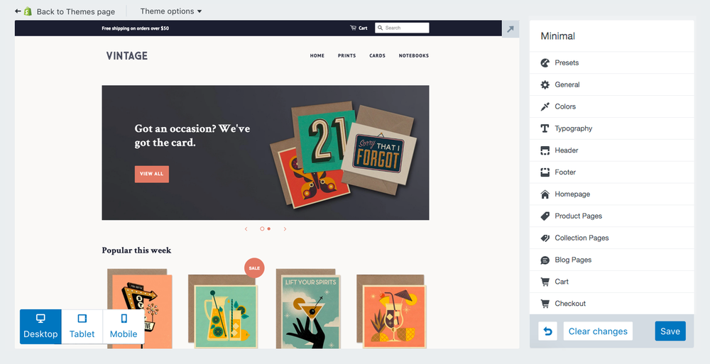
The existing storefront editor, launched in 2015.
Approach & Iteration
We had a clear goal to begin with: Make dynamic, drag and drop content editing possible. The challenge was: how do we make that happen? I began by exploring different concepts of how interacting with content. What might it look like to add content? To edit content? Our initial approach was one of control—control the presentation, and the layout, of content completely.
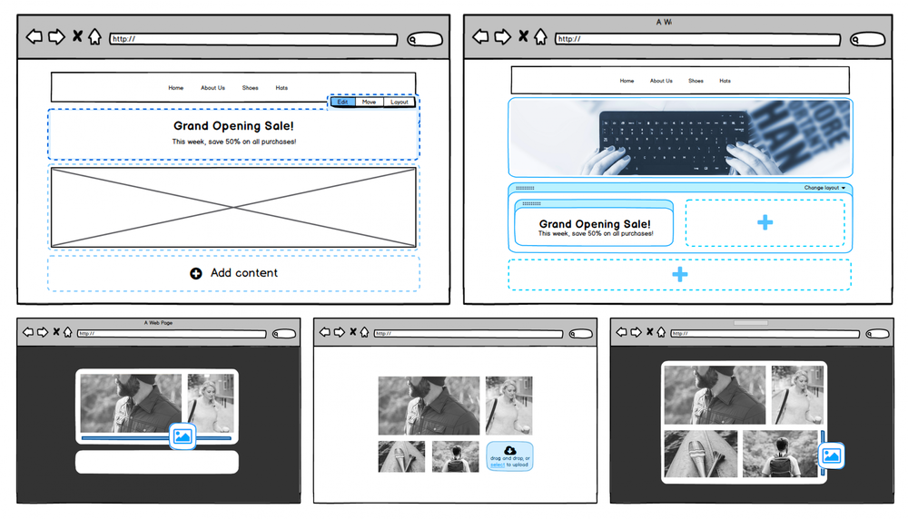
Early interaction concepts where the layout, presentation, and content was editable directly.
Although this approach was simple to conceptually explore, and tested well in concept testing sessions, it soon became apparent that this approach was not aligned with the strengths of the online store: leveraging unique designs by our partner community.
Upon this realization, the dev lead and I tried a different approach—let’s look at as many patterns of website content structure, and see what we learn. After reviewing dozens of sites, we had clear and resounding learnings.
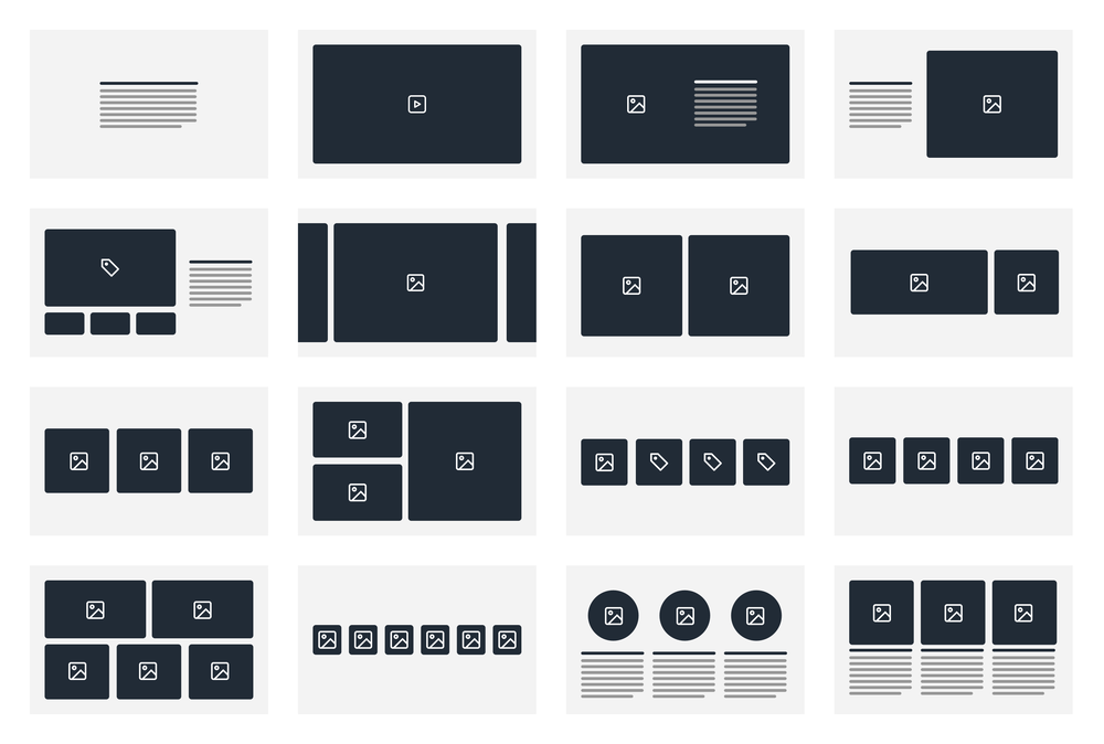
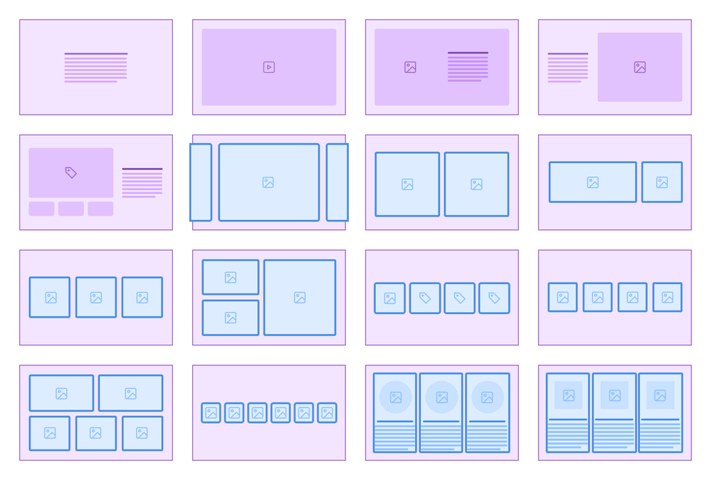
Common content layouts for online stores we found in our research.
Learning 1: Stores that share the same content hierarchy, often do not share the same presentation. In other words, just because you store the data in the same way, it doesn’t mean you’d want to showcase it in the same way.
Learning 2: Store content is made up of variable hierarchies of content. In other words, sometimes content is a singular object, sometimes it’s multiple objects, sometimes it’s multiple objects, with nested content inside. It’s unpredictable.
The approach we needed to take for #1 was clear — Themes must control presentation in order to be able to offer the varied appearance merchants had come to expect.
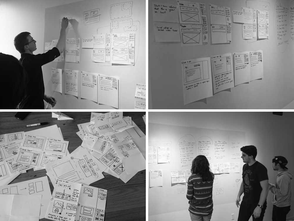
Collaborative UX sprint with engineering, exploring different ways of interacting with content.
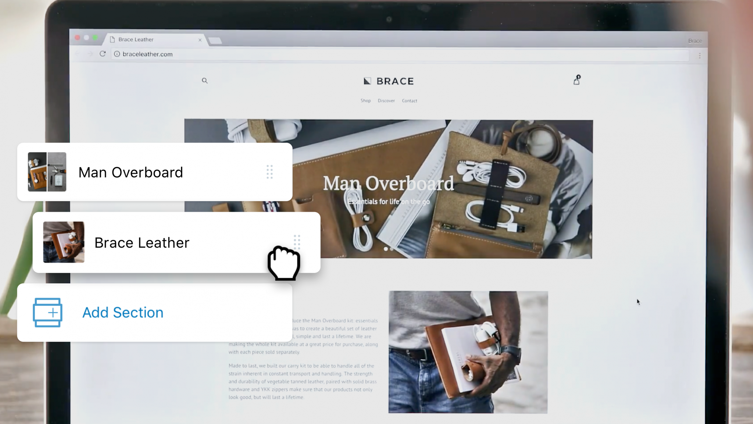
#2 Was more difficult. Some “blocks” were 1 level, others, could be 2, 3, or even 4 levels of nested content. After exploring the patterns we researched, we had an aha! moment, when I stumbled upon calling the containers for blocks “sections”. All of a sudden we had a way to facilitate 2 levels of content nesting. The highest level would be called a section, that optionally contained blocks. We decided that this stuck an appropriate balance, of control and flexibility. It would give most merchants the control they needed to build what they needed.
Common store layouts deconstructed into sections (in purple), and blocks (in blue). In the simplest case, sections contain no blocks (first five examples), and in others they contain blocks with multiple types of settings, such as text and images (last two examples).
I revisited the interaction design with this new conceptual model. Upon re-exploring, it became clear that interacting directly with a section was relatively simple, but selecting a block within a nested section could be more complex. For this reason we decided to move the editing controls into the sidebar exclusively, and use the preview for navigation, and a true preview. Disconnecting the editing from the content directly made it important to visually connect the two spaces with similar imagery, iconography and content.
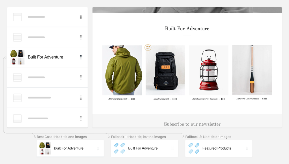
The sidebar is made to visually connect with the preview. Because the preview content was dynamic, we built a system for generating sidebar content that uses whatever content is available.
Outcome
Upon launch, the product was very well received by merchants. Merchants loved it, but they wanted to be able to use the powerful sections on all of their online store pages. Since launch, the updated themes and theme editor have become the new standard for creating a Shopify store. The concept of sections and blocks has become the foundation for the online store product and future developments.
| Old Theme Editor | New Theme Editor |
|---|---|
| ✓ Edit theme settings | ✓ Edit theme settings |
| × Add content | ✓ Add content |
| × Reorder content | ✓ Reorder content |
Lessons
This project me the importance of knowing the competitive advantages of your product early on. Knowing competitive advantages is helpful to determine areas of exploration worth considering first. It also highlighted the importance of having a deep understanding of existing user behaviors and actions. Lastly, it made clear that creating something totally new and innovative takes a lot of time to get right, compared to projects where it’s an incremental feature addition.