October
At Shopify every few months we have something called Hackdays. On hackdays, you get to work on projects that are special to you, and I decided that I’d work on a month for a designer calendar. I decided to focus on October, as it’s the peak of when all the fall colours are changing and the leaves are falling. The calendar didn’t end up panning out, but I was happy with how the lettering turned out.

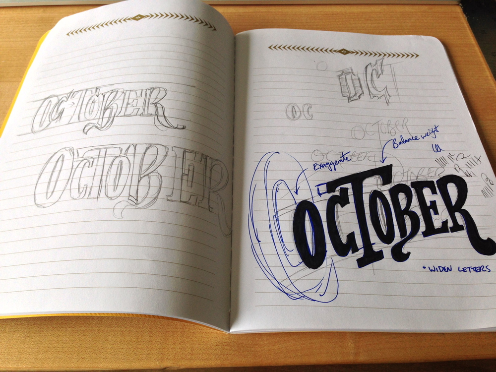
I started off getting an idea of styles, and how the characters could fit together. After doing a few rough sketches, I made a couple tweaks in pen. These early sketches work to inform the higher fidelity lettering. After nailing down the style, I moved on to a larger size.

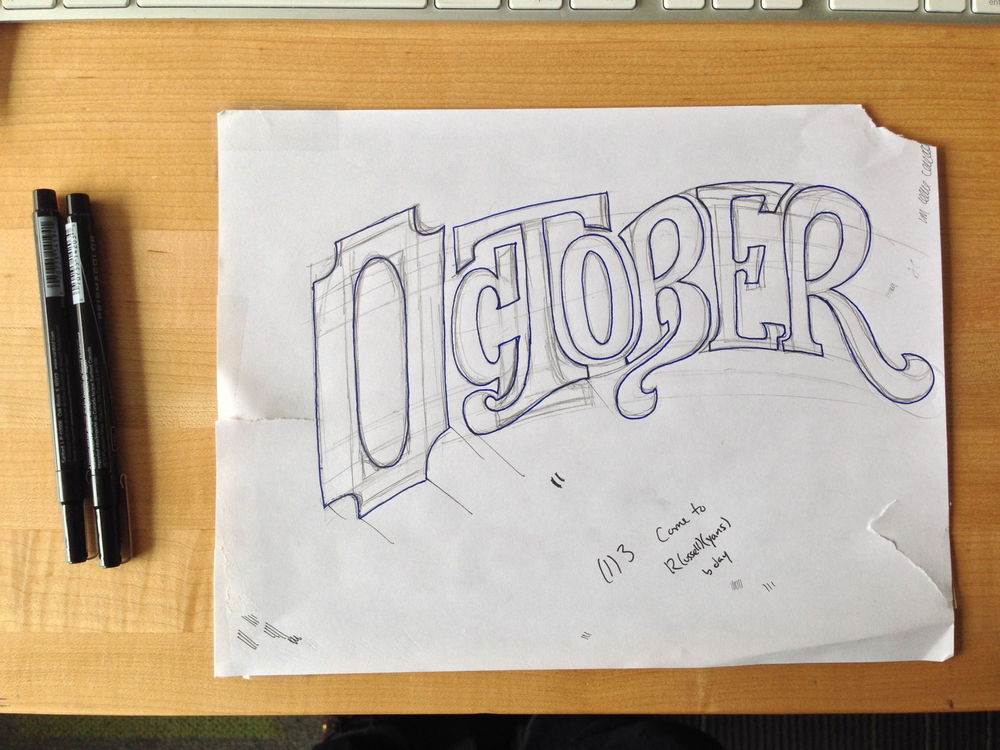
At this stage, I probably should know what the details for the piece are going to look like. But usually I don’t. At this point, I know the basic letterforms. I play around with sketching out the character outlines until the shape seems about right. Then, the next step is to trace it all in pen, so that it can be traced on a piece of paper above. You can see here that the paper is pretty roughed up. I decided to tape it to the table, to keep it in one place, but the tape worked a bit too well. You can see here that the 3D have been added, but at this point I still wasn’t sure what to do with them.
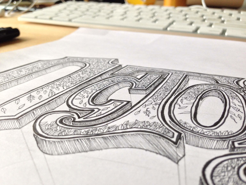
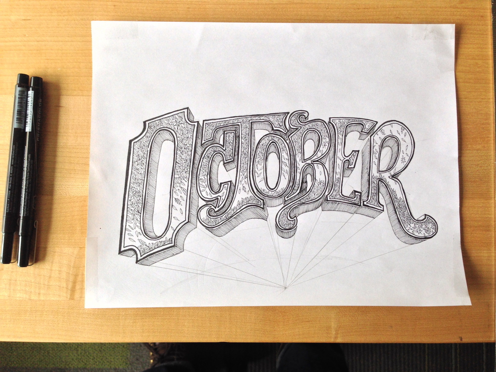
After getting down the final shape, I moved on to adding the details. I decided to go with a falling leaf pattern, and 3D perspective.
Tip: The trick to making realistic 3D depth, is to make sure that the line length is always the same. If you can get that right, and make sure that lines are all parallel, or converge to one point, it’ll look right.

I didn’t quite polish this up and get it complete, but I kind of like that it still has the perspective lines. You can see a bit of the process in it.
